Time
Brand Identity
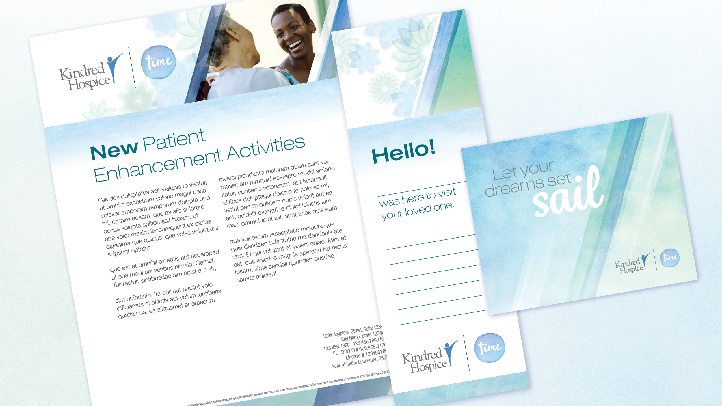
Time is a program within Kindred Hospice designed to create meaningful moments of connection between patients, families, and caregivers. When the client approached us, Time had an existing logo that had been regionally distributed and a graphic system that focused on nautical imagery from the coastal northeast. With a national program rollout in the works, we needed to clean up the logo script, re-think the nautical imagery and make the brand work with the larger suite of Kindred Hospice materials. The final design uses watercolors as a replacement for the literal on-the-water imagery and cool colors to convey a sense of calmness.

There were a large range of logo applications, both internal and external, requiring a range of logo lock-ups.

Script evolution from original (right) to final (left).


To create the brand elements, we took existing Kindred Hospice flower design and lines and re-imagined them in watercolors.